Visual Identity Design
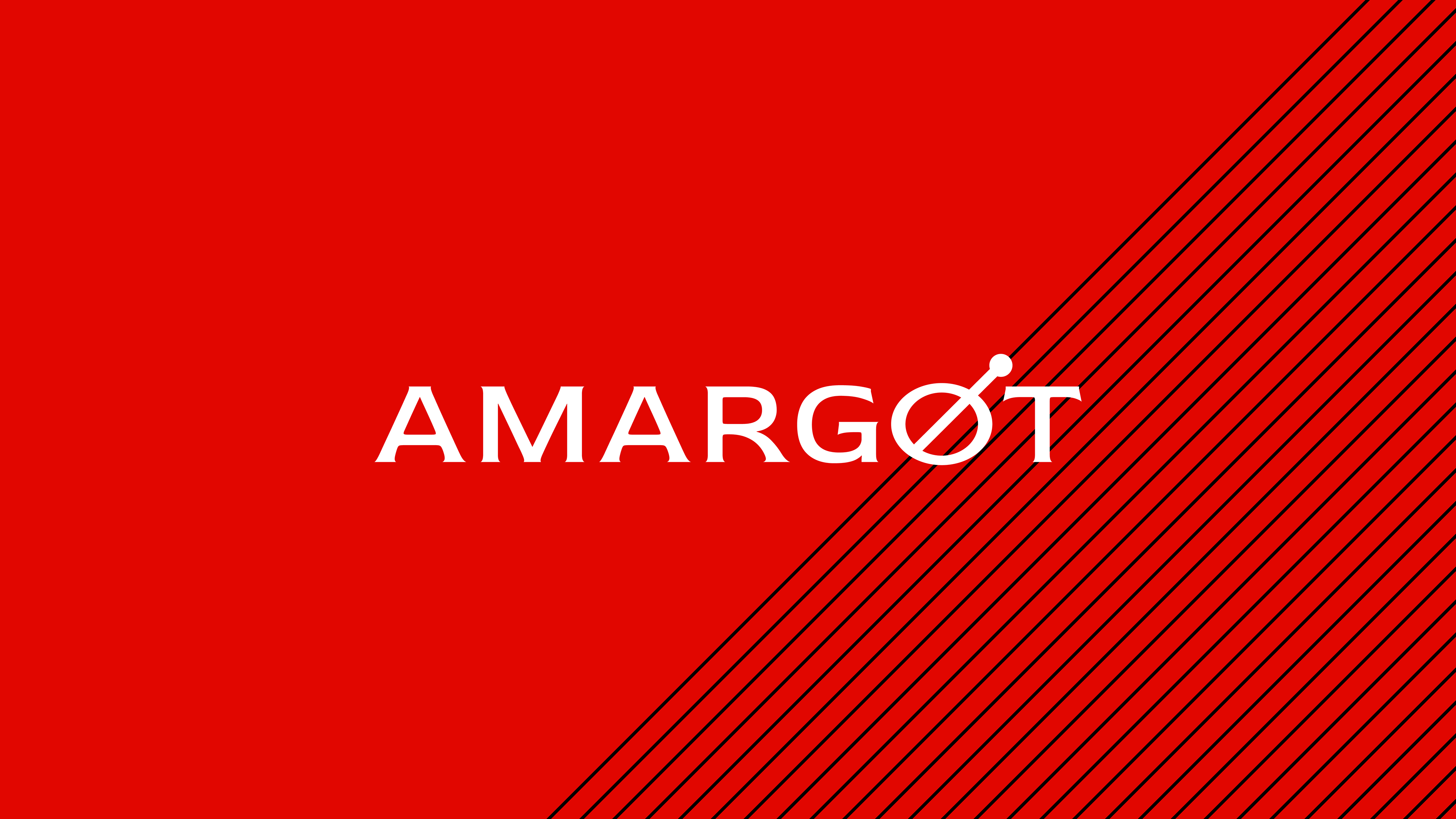
Amargot Cocktail Bar
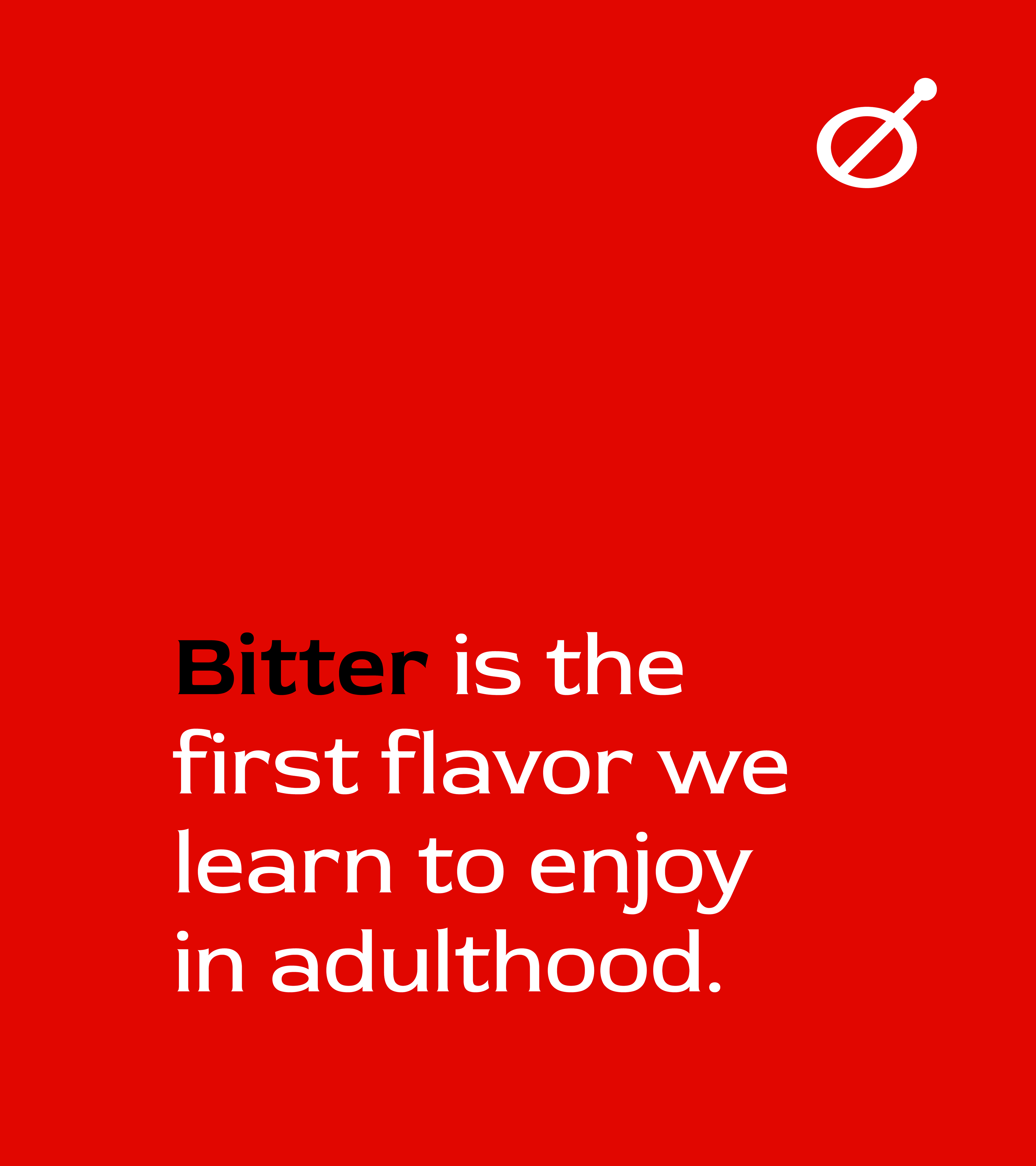
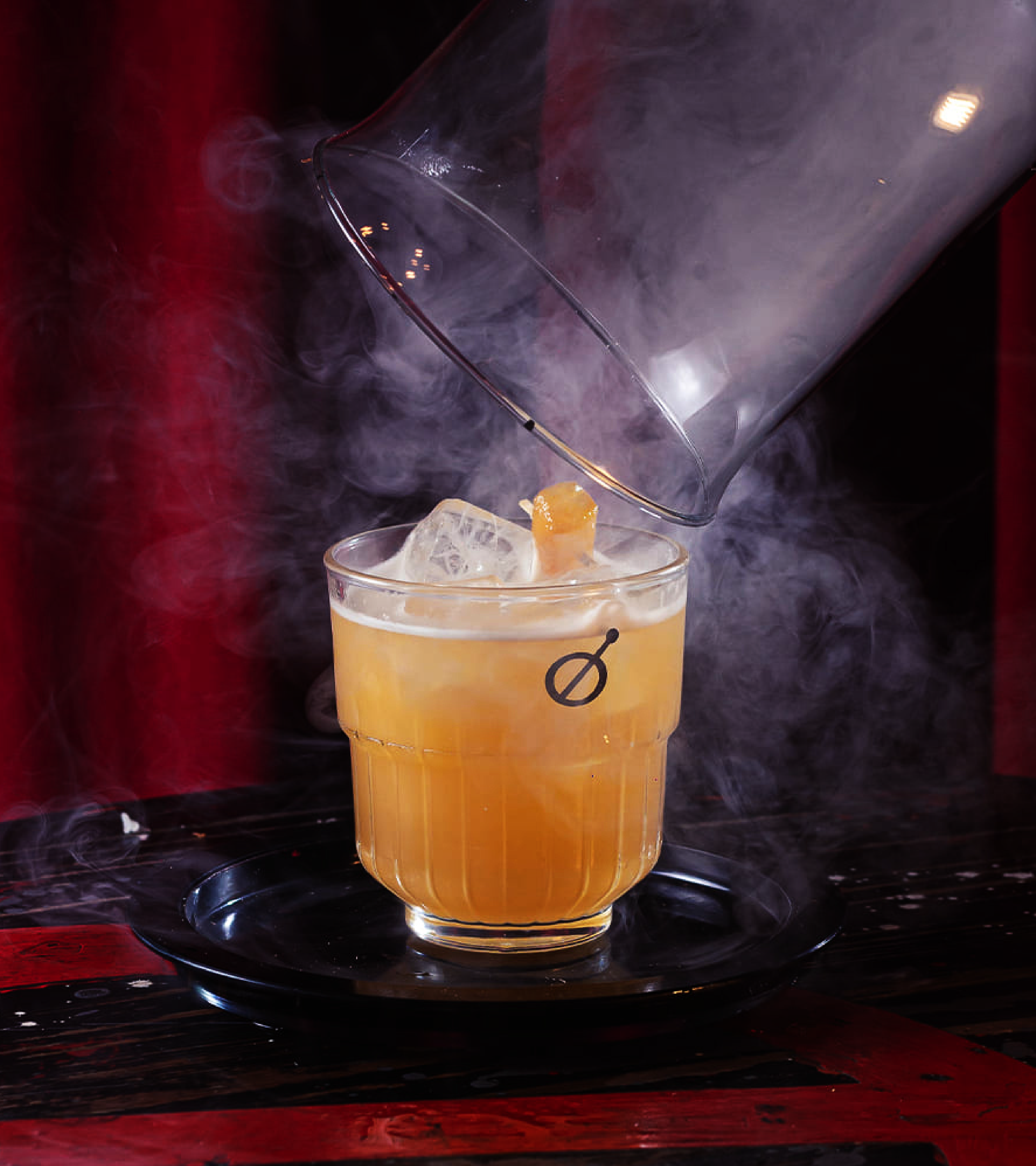
The challenge was to create a brand that would bring new experiences to the cocktail market, positioning itself beyond the traditional Negroni and exploring uncharted territories of bitter taste.
The target audience, composed of urban professionals between 28 and 45 years old, sought transition rituals after work but felt limited by conventional market options. It was necessary to create a proposition that was both sophisticated and accessible, capable of educating the palate without intimidating the consumer.
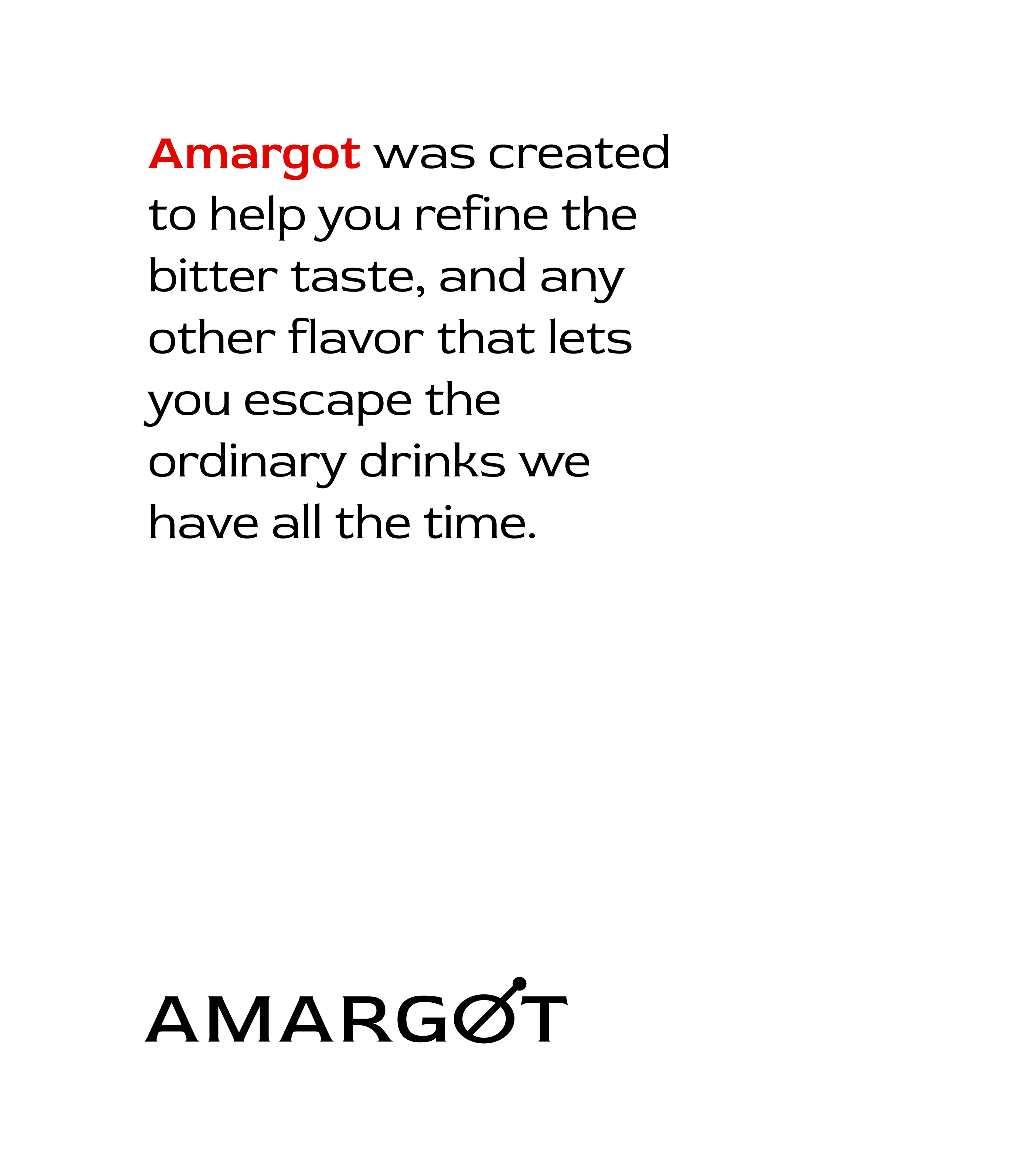
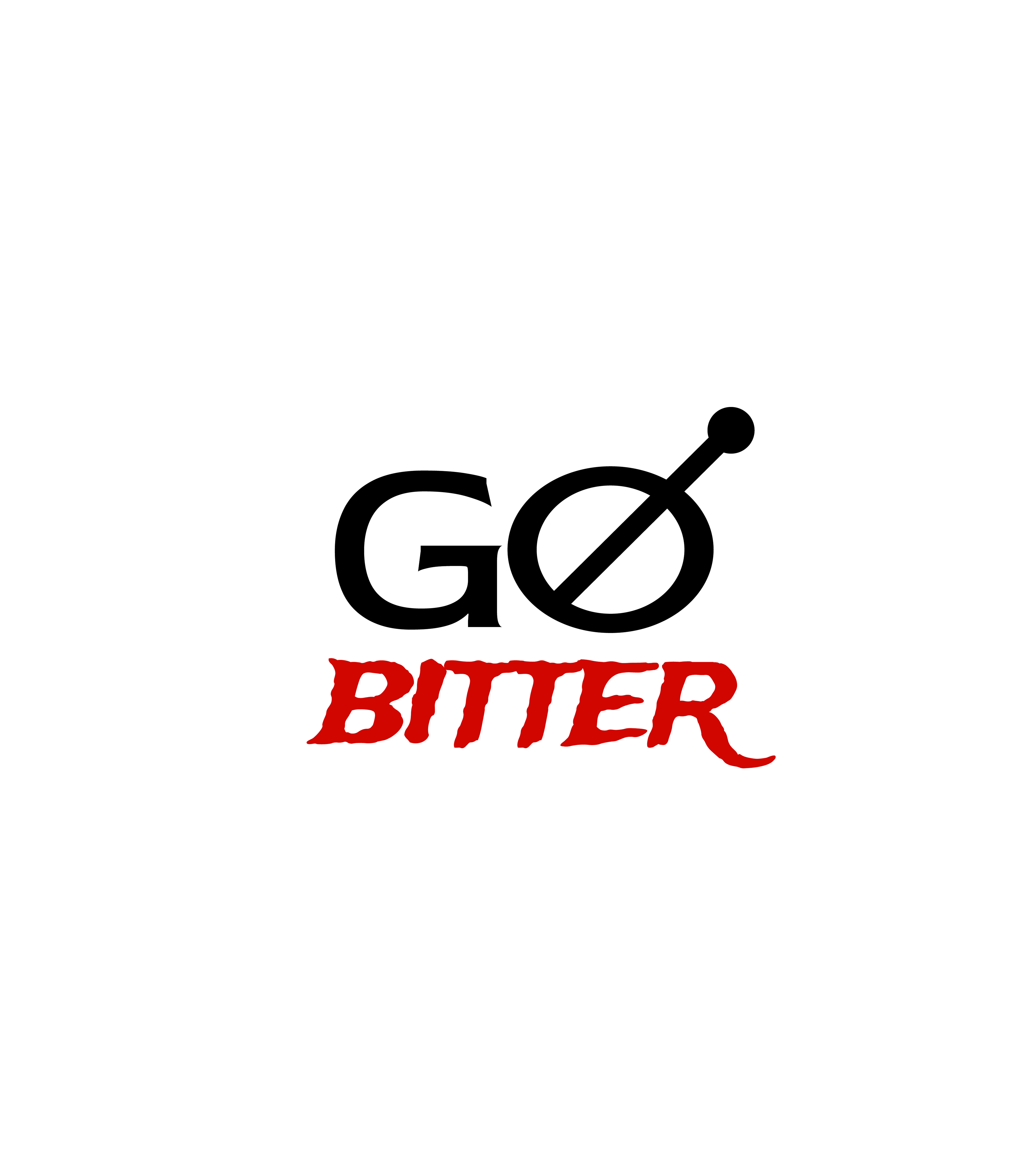
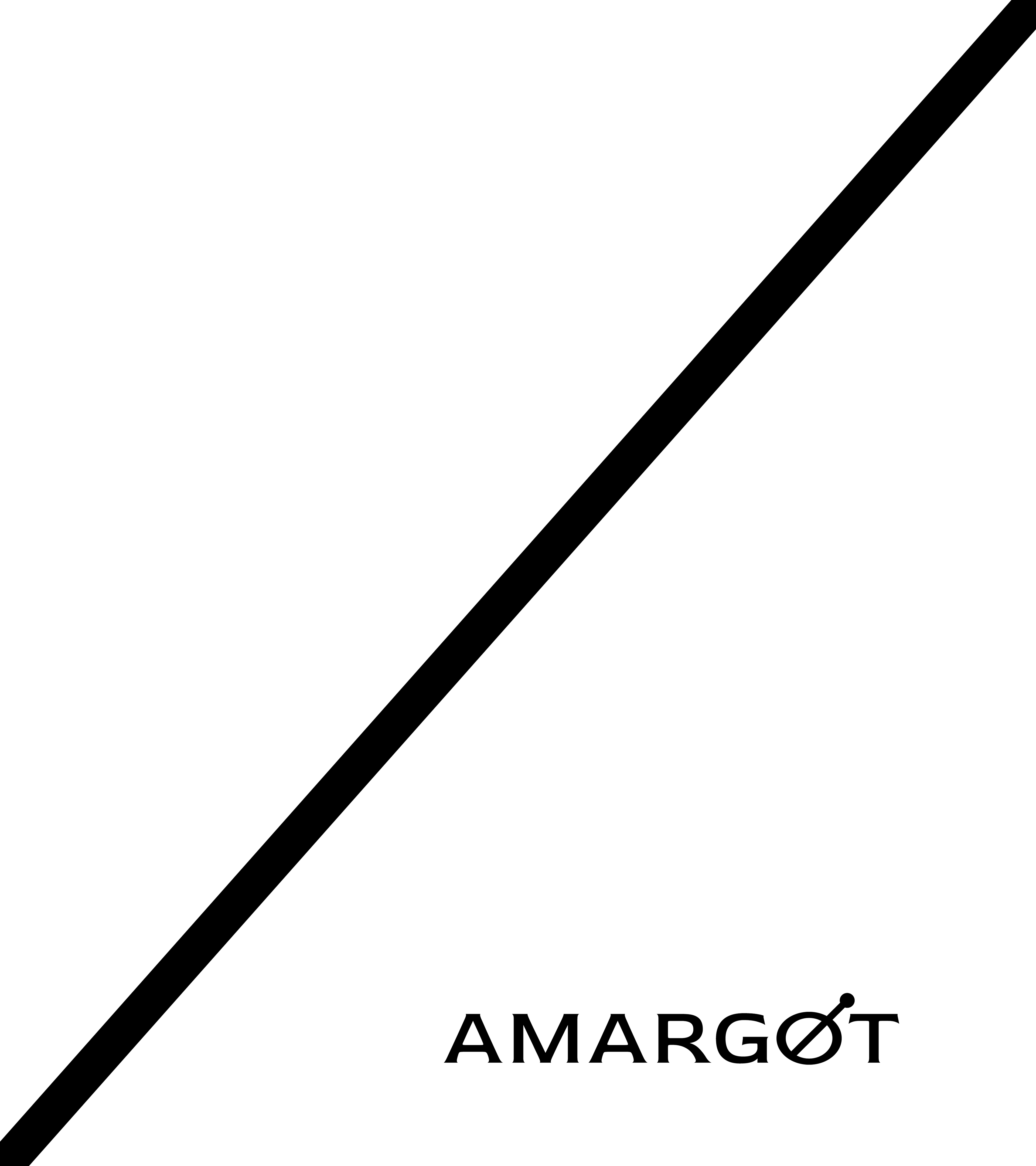
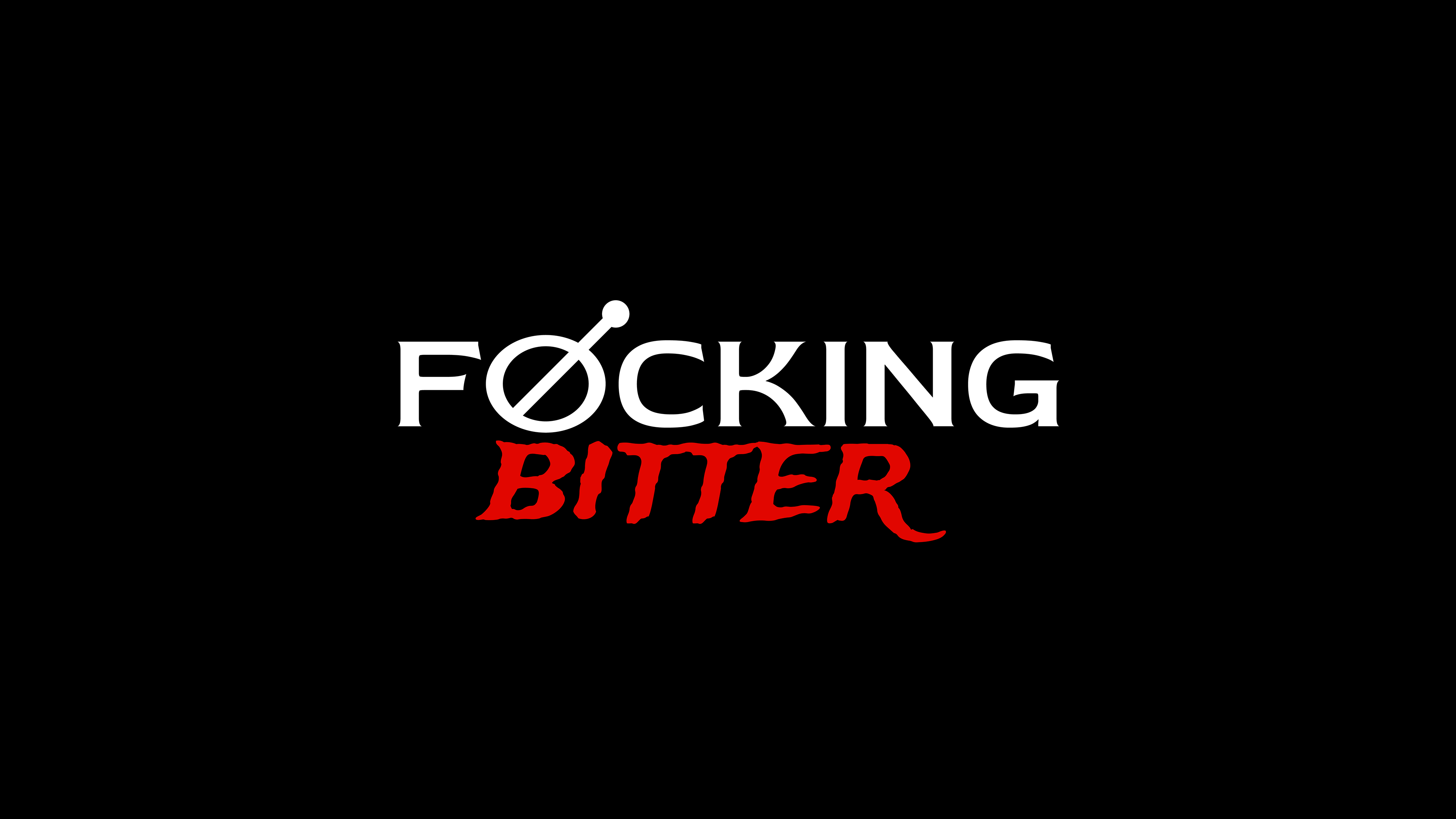
The solution came through the naming "Amargot," an intelligent fusion between "amargo" (bitter) and the French suffix, creating a sophisticated sound that refers to the French tradition of aperitifs.
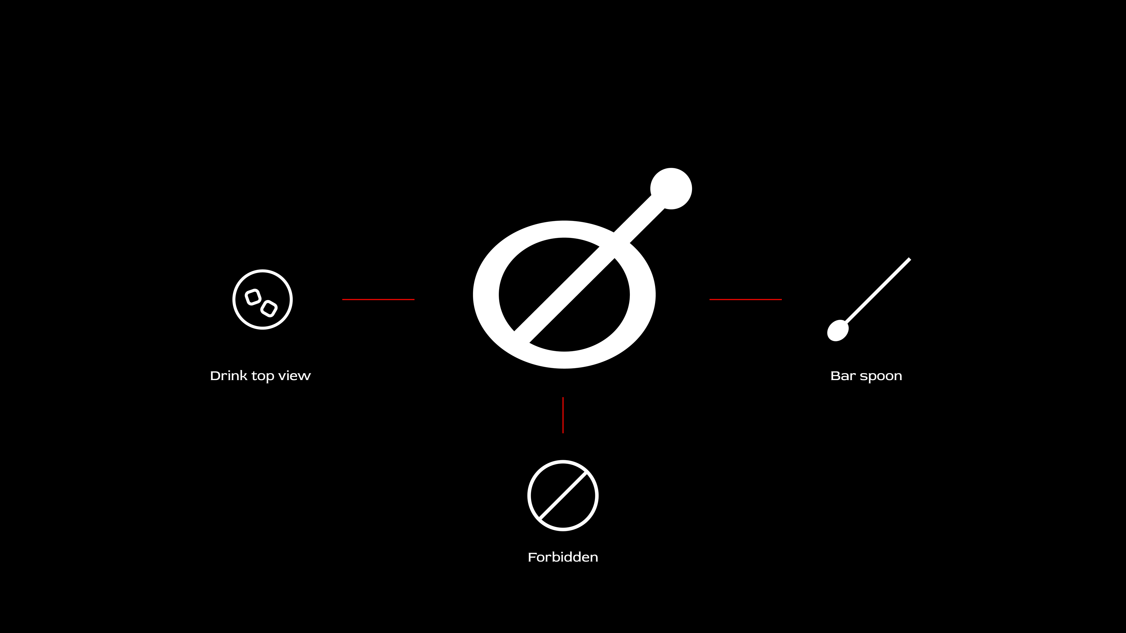
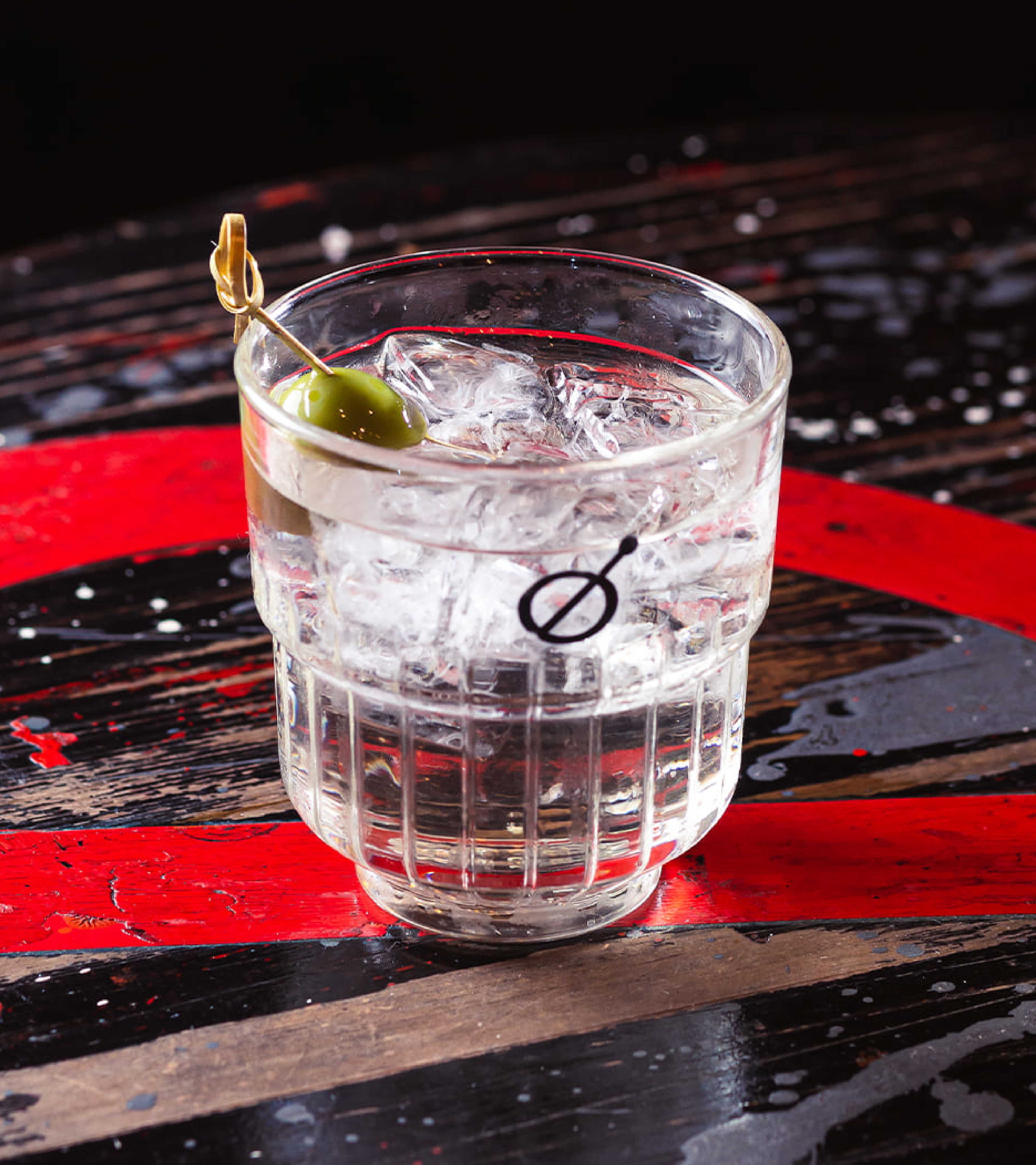
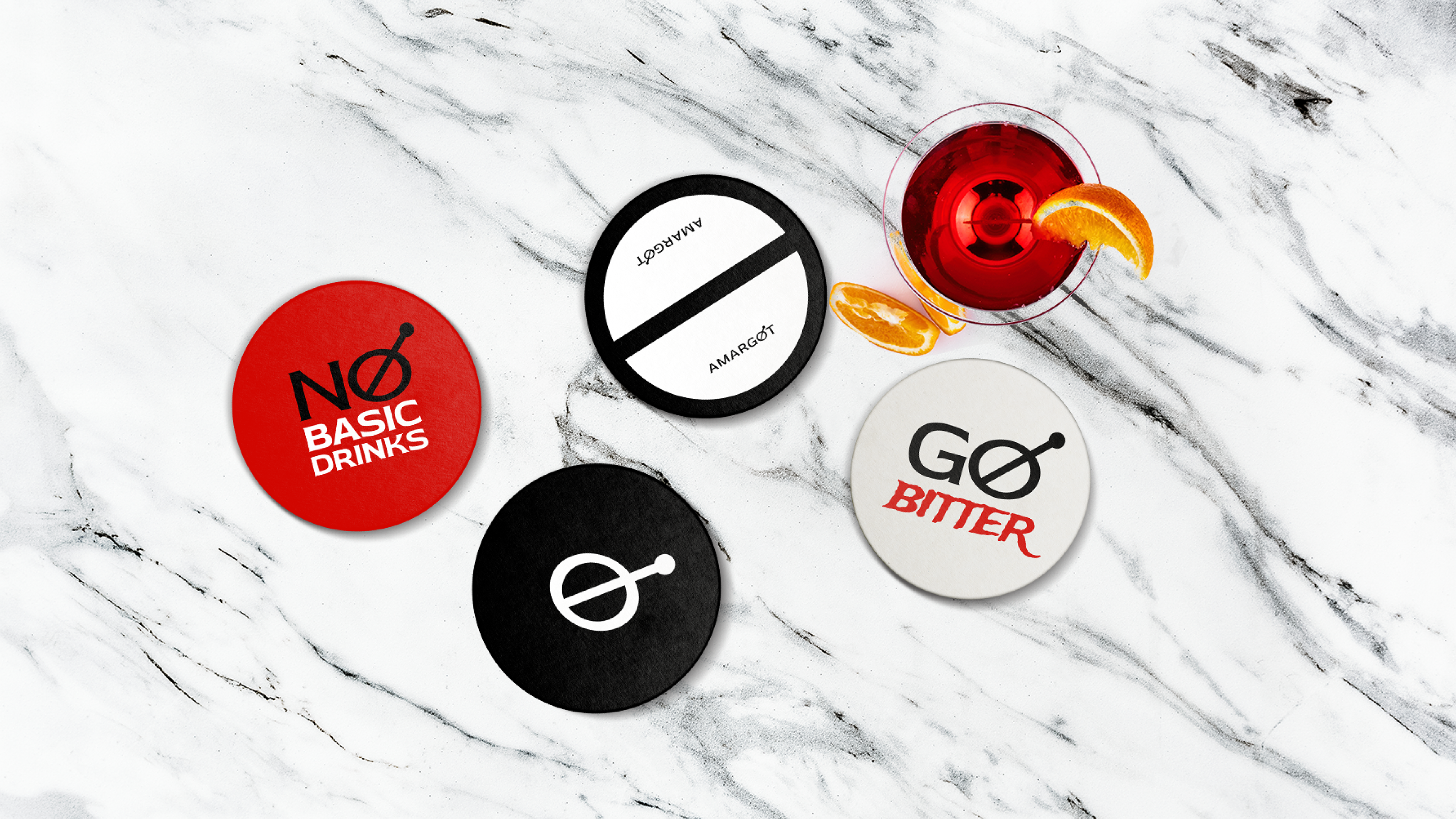
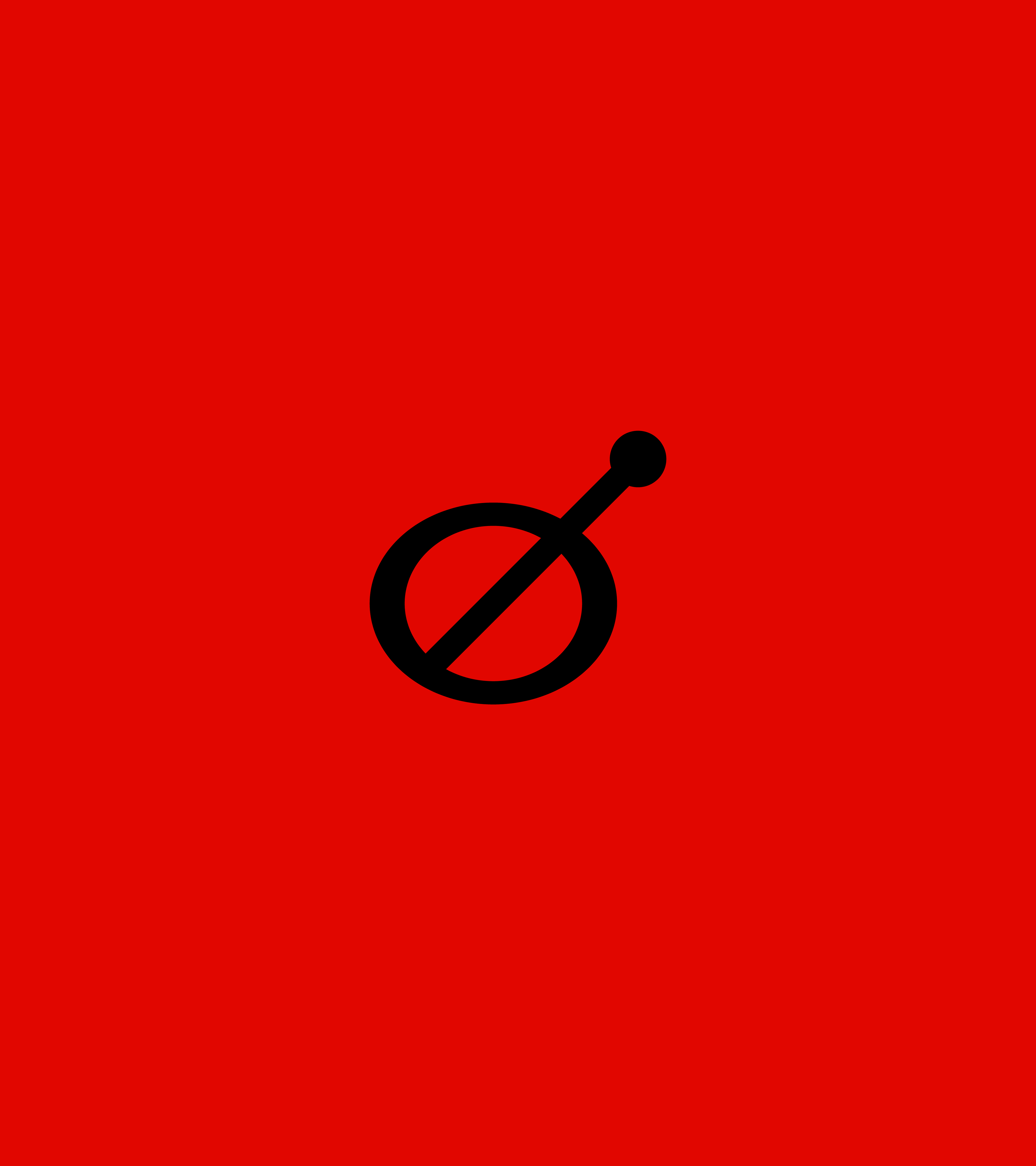
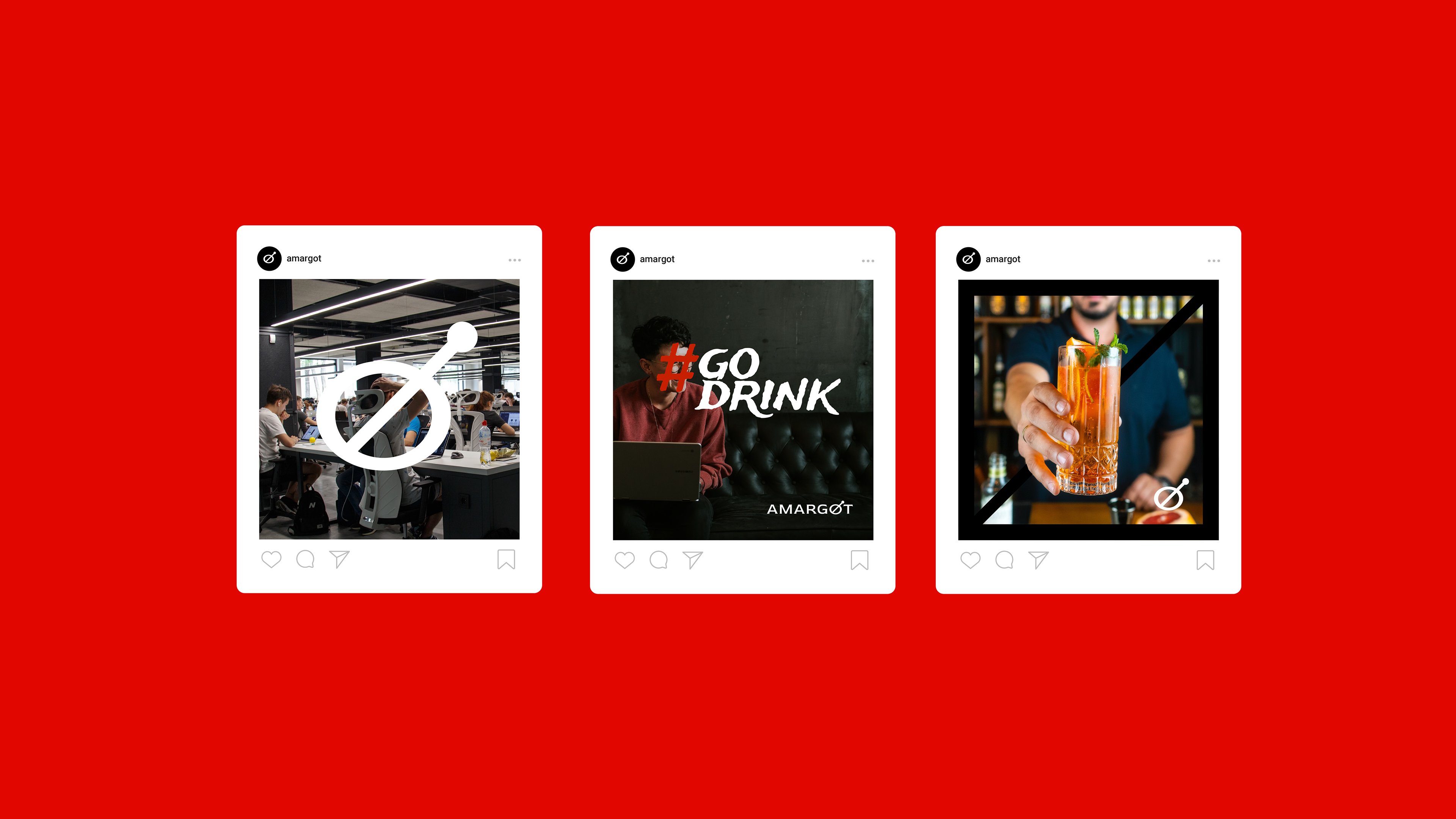
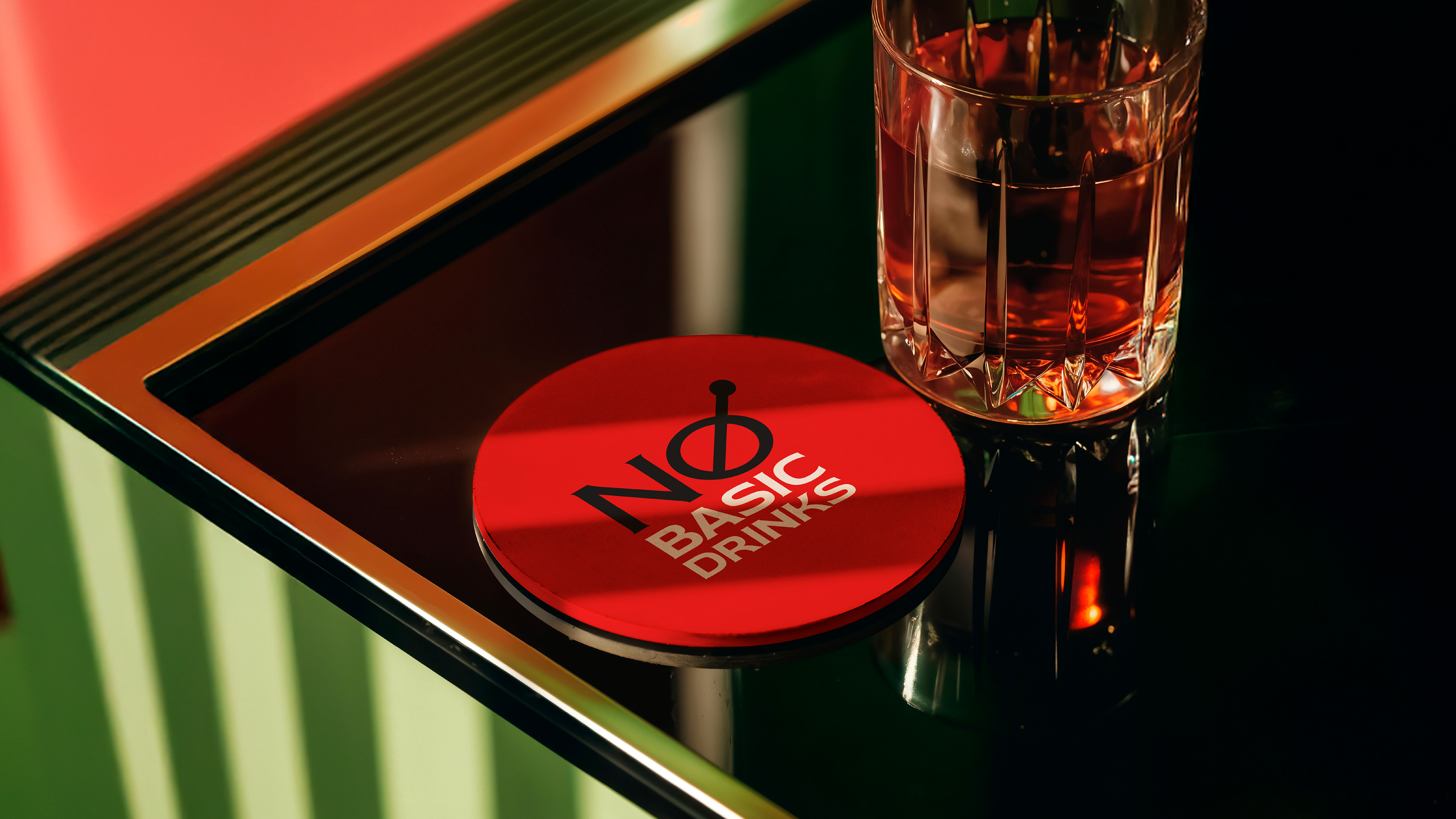
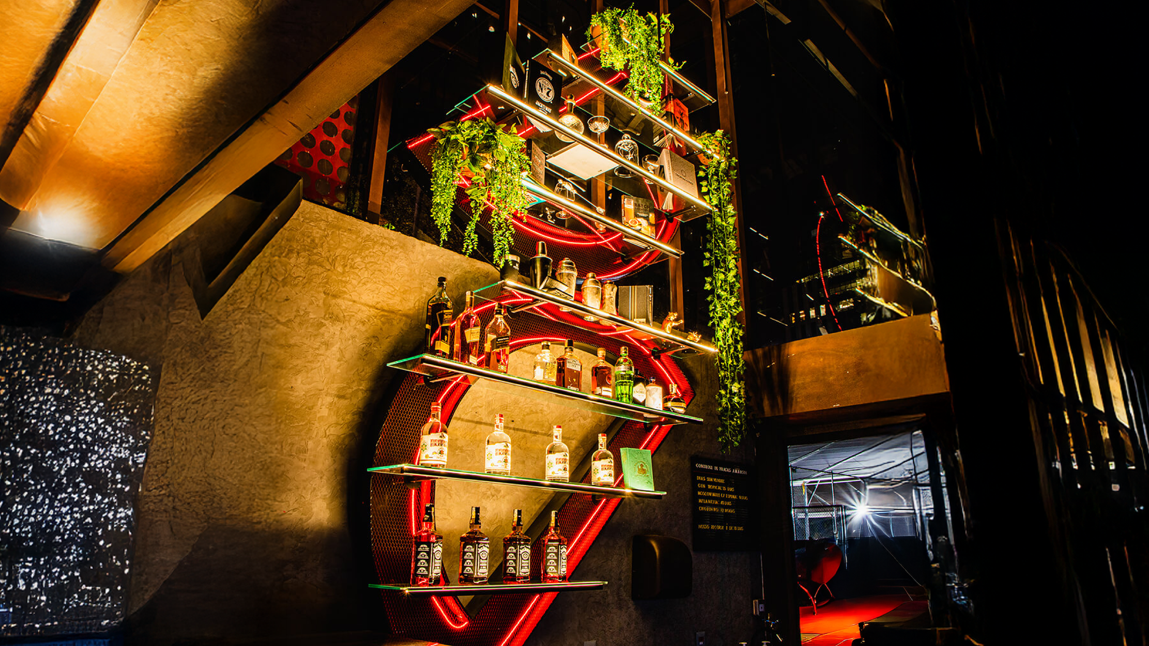
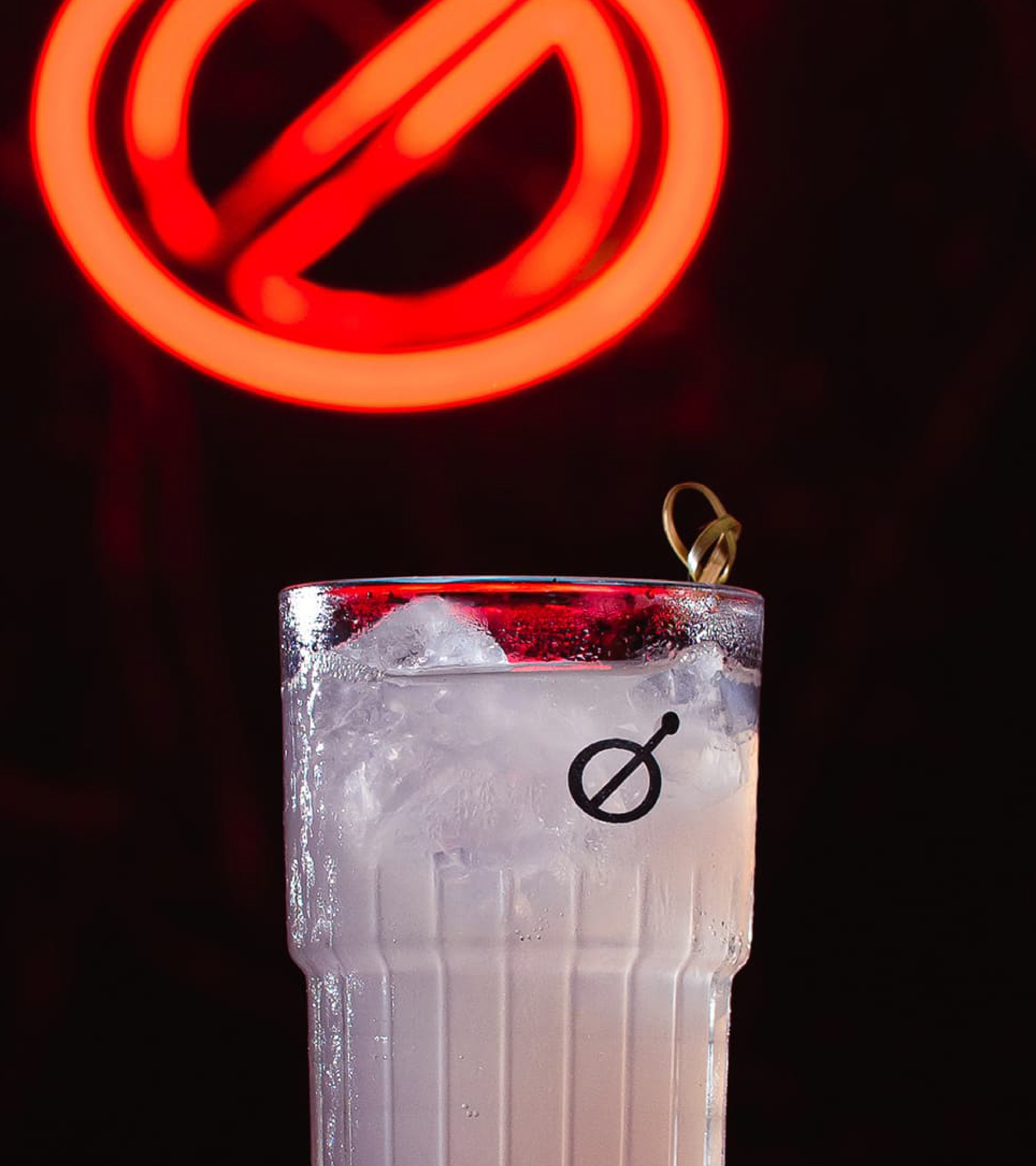
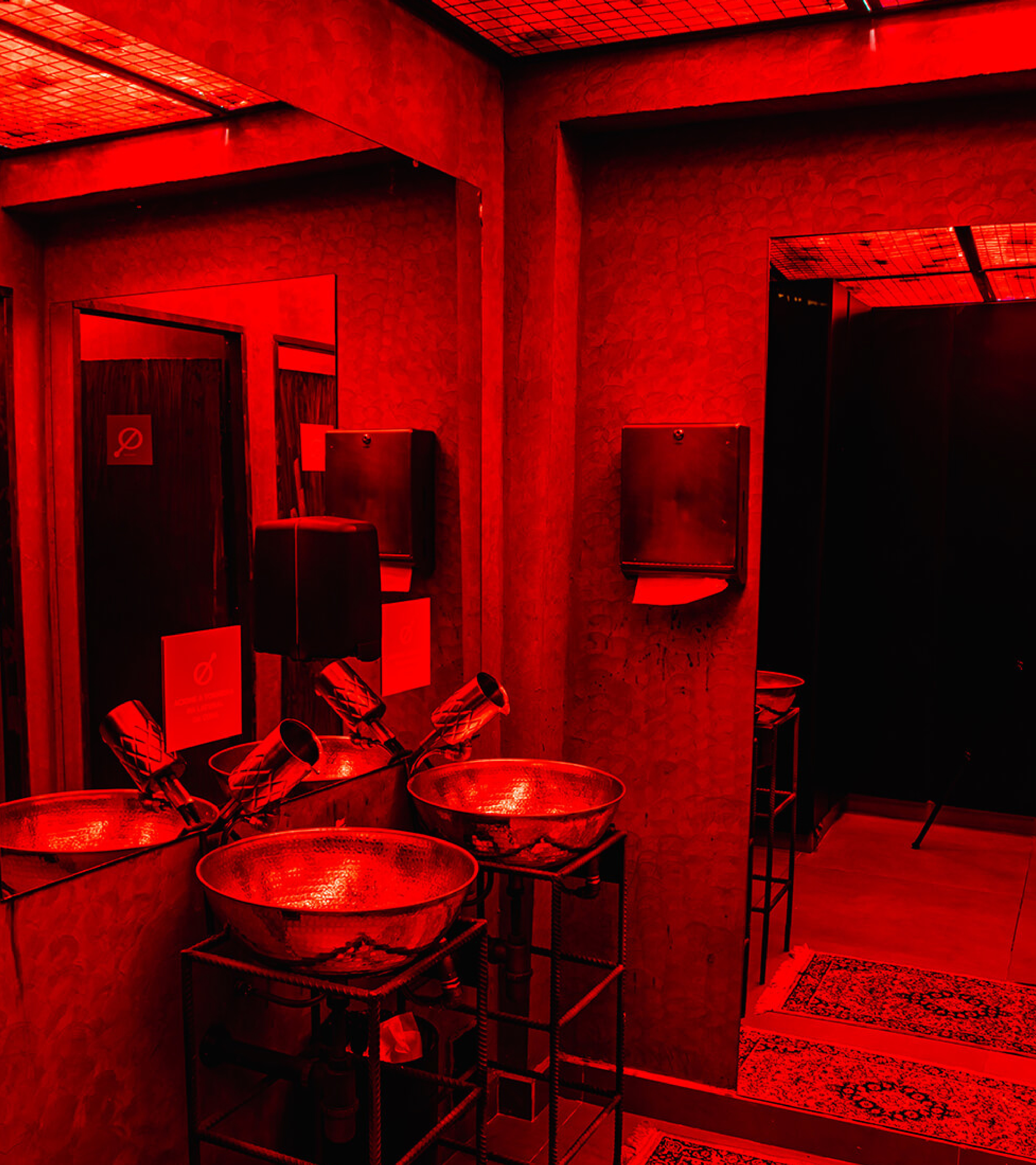
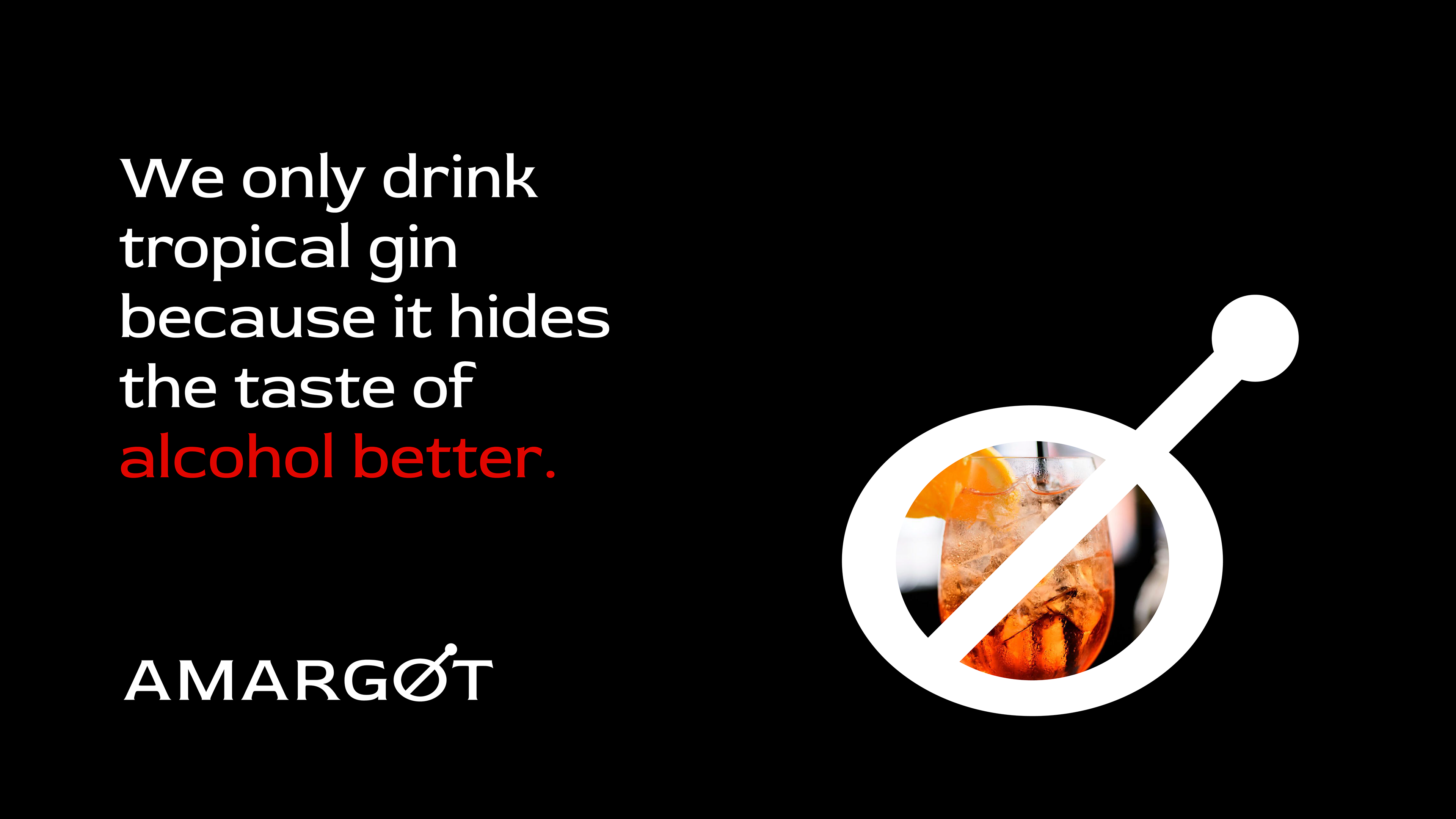
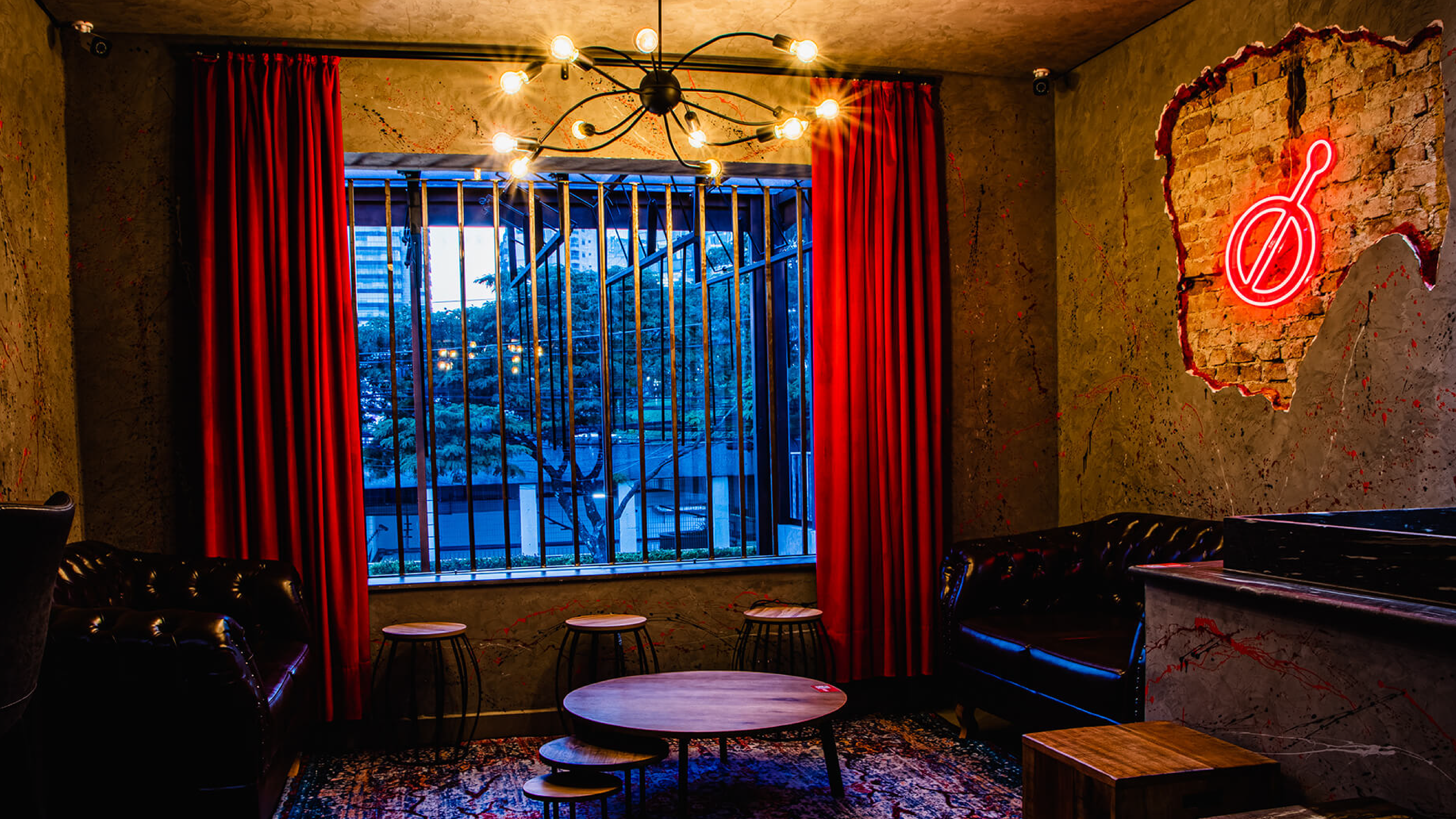
For the symbol, a combination of simple concepts. The drink top, bar spoon, and the prohibition sign convey a protest: here is not a place to talk about work, but to enjoy the moment and have fun.
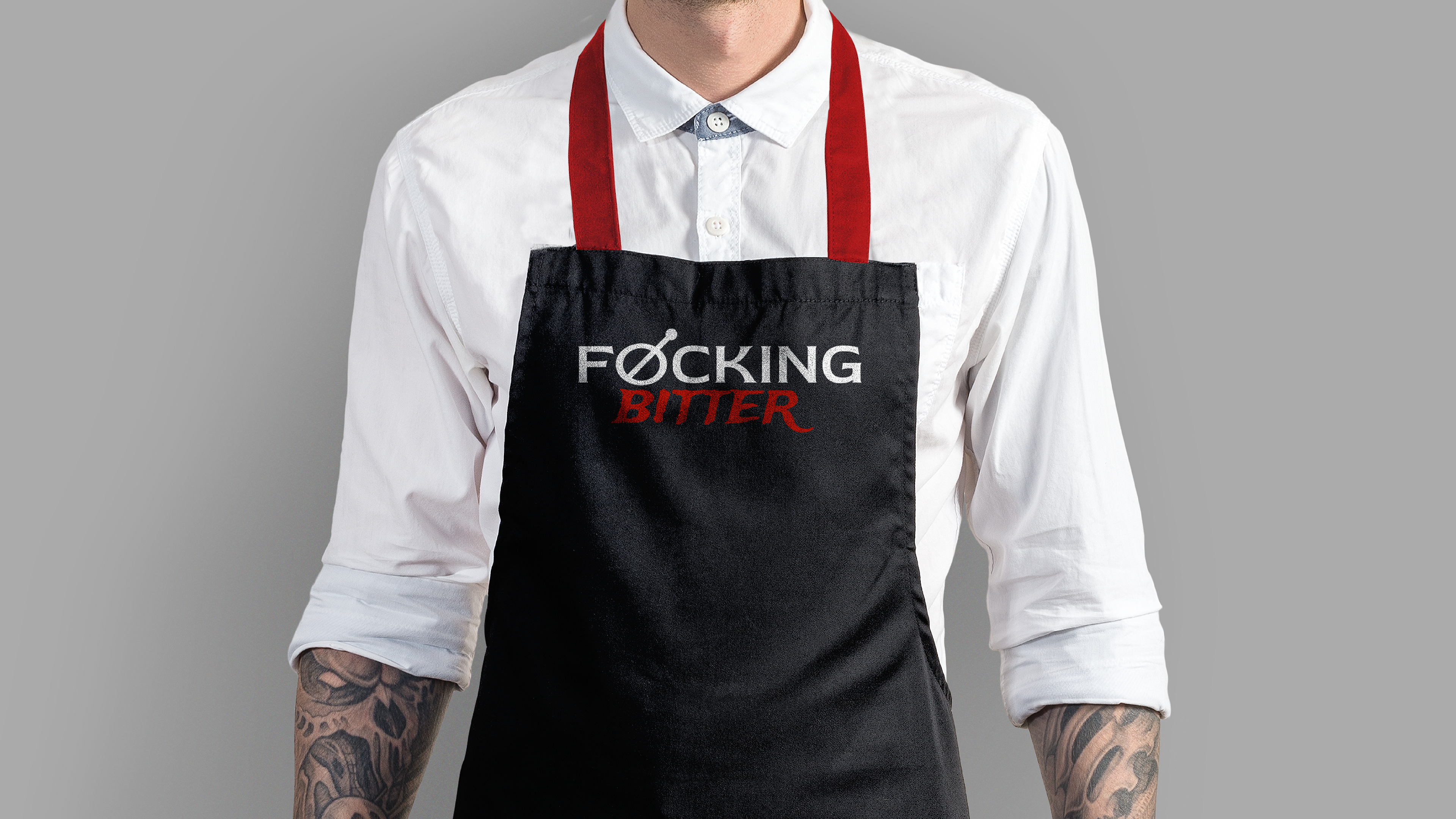
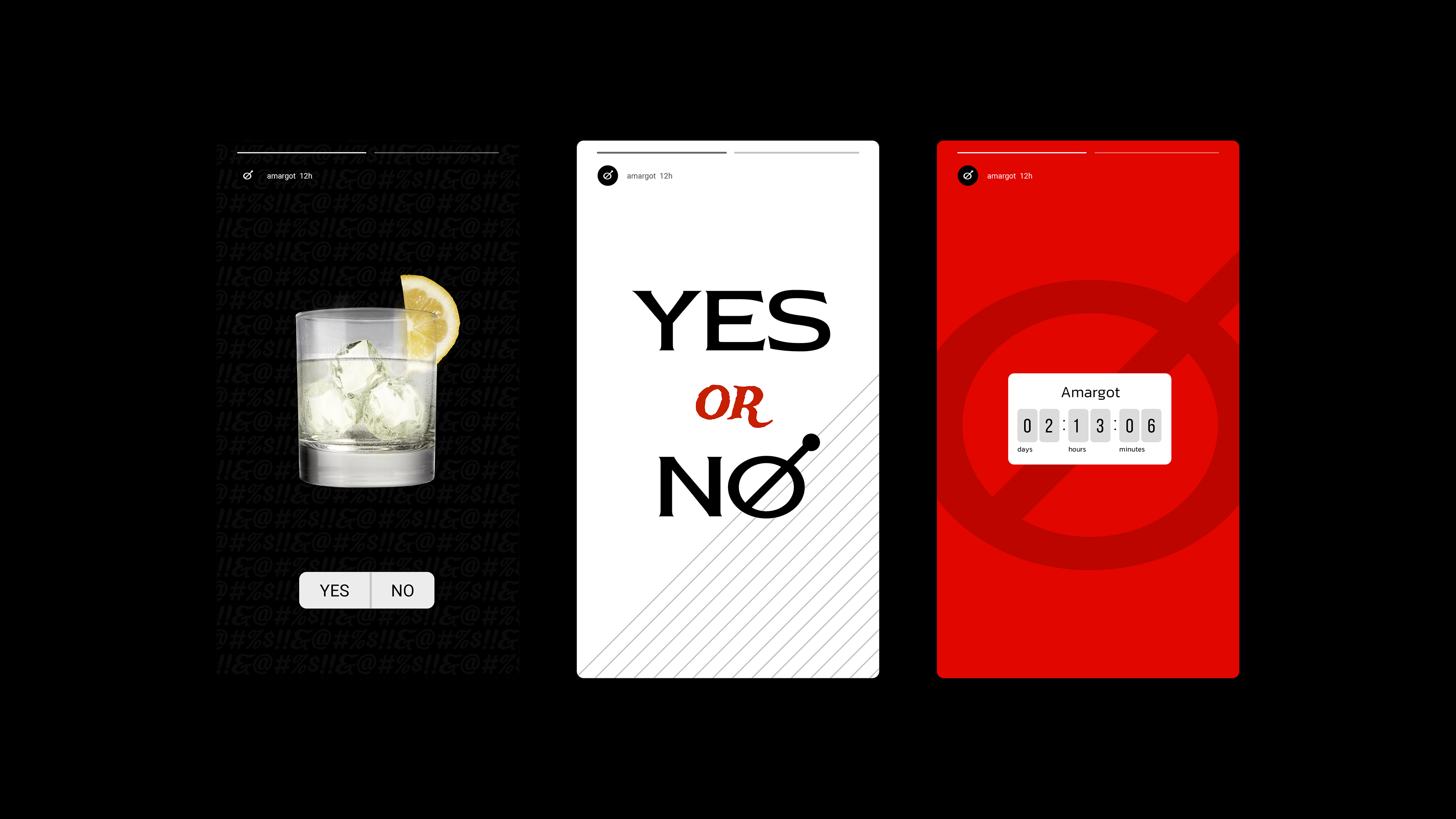
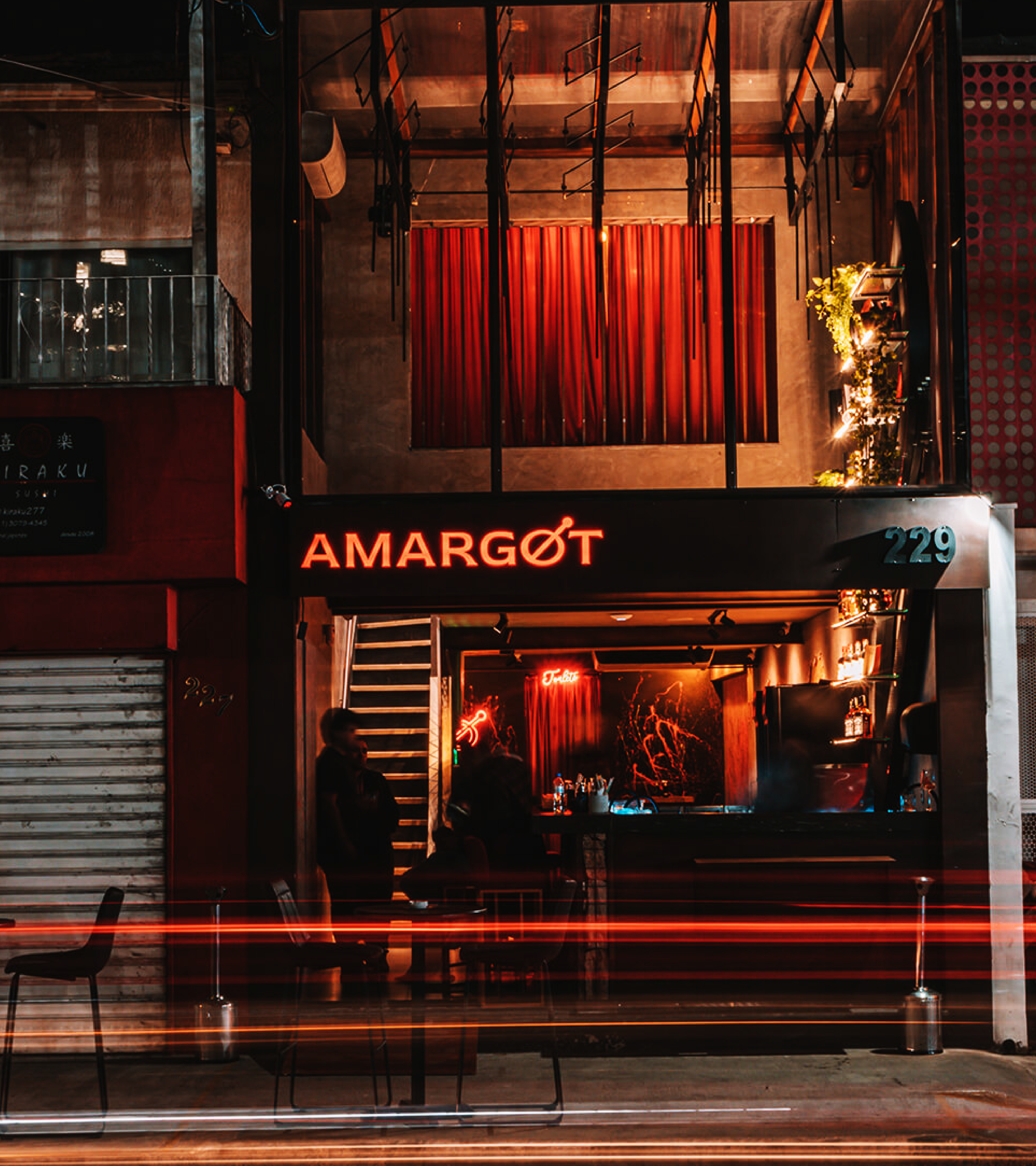
The visual system extends from the physical bar environment to social media, always maintaining the provocative and direct tone that challenges consumers to step out of their comfort zone.
Creative Director
Fernando Degrossi
Brand Designer
Anderson Rodrigues
Naming
Renato Renas
Brand Studio
Voadora Design

Got a project in mind?
Let’s work together
androdriguespp@gmail.com